Rebranding for slow food & farm to fork business
Portfolio /
Everybody loves family-owned enterprises, don't they? We certainly do. Slow food? Farm to fork? Ethical farming? Yes, those are absolutely our cup of tea. Please welcome Albota to our portfolio.
Nestled somewhere around the picturesque town of Sibiu and its surroundings (to be more precise, in Arpașu de Sus), a family embarked on a venture in hospitality and slow food. After more than a decade of neglect in terms of branding and communication, we stepped in to breathe new life into this fantastic ecosystem of businesses.
We accomplished this by seamlessly integrating two distinct concepts:
The Slow Food Movement: A philosophy initiated by Carlo Petrini many years ago, Slow Food envisions a world where all individuals have access to and can savor food that is not only good for them, but also good for those who cultivate it and the planet. Their approach is founded on three interconnected principles: good, clean, and fair.
The “Farm to Fork”: concept and politics from European Parliament. Farm to fork is a sustainable food system approach that underscores the direct and transparent link between agricultural production and food consumption. Its goal is to minimize food waste and promote local, organic farming.
When we initially engaged with the Albota businesses, we discovered that their commitment to quality extended far beyond merely owning a grocery store stocked with a wide range of traditional Romanian products (Băcănia Albota). They took pride in producing these items on their own farms, utilizing their processing units and packaging. From A (terroir) to Z (grocery stores), their business was truly a "Farm to Fork" concept.
Challenges
An unnecessary connection between their IT company (Sobis) and their hospitality-based enterprises, which could be confusing for customers. Consequently, addressing this issue was among our top priorities when addressing the brand's challenges. This is one of the most common and significant mistakes entrepreneurs make: mixing branding from different industries, using the same name and identity without a comprehensive branding architecture.
Incoherent brand architecture: Since there were numerous different businesses collaborating, it wasn't clear how they related to each other. We recognized the need to establish a unified brand architecture.
Wrong positioning: Their branding didn't align with their target market, and their labeling was outdated, conveying a lower positioning (mass market vs. upper-medium).
Now, having had insights into how these enterprises operated and their shortcomings, we were prepared to initiate the upscale branding process we had in mind.
Our idea: create an umbrella brand
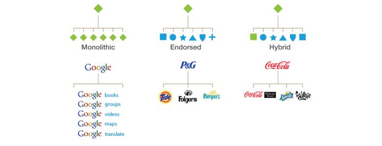
Our chosen strategy within the brand architecture was to establish an umbrella brand that embodies the values of all the brands within the ecosystem, much like Google's brand structure. We aimed to create something that would represent all the brands in the ecosystem.
In their case, the brand architecture would look like this:
"Povestea Albota" would serve as the central narrative, with its dedicated landing page and website, from which we would extend our branding efforts to the other components of the business.
Our clients agreed upon our approach and wanted to implement it in the long term. However, in the short term, they wanted us to begin with rebranding "Băcănia Albota."
In the following sections, you'll see the process we undertook for this segment of the business, but please keep in mind that our ultimate goal is to develop this brand architecture across the entire ecosystem of businesses.
Băcănia Albota gets rebranded first
Our primary objective: Elevate the grocery store's brand to match the exceptional quality of its products. To achieve this, we had to consider every aspect, from labeling and logo design to interior aesthetics and even social media and communication. Let's break down each aspect individually.
First on the list: logo & visual identity.
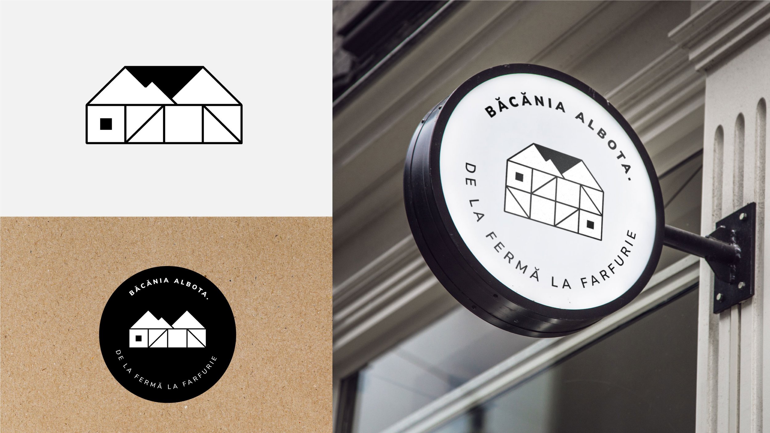
Our task was to encapsulate the essence of our client's diverse enterprises in a single, cohesive identity while considering the future implementation of our branding architecture. The logo features a system of grids, symbolizing the integration of their businesses under one roof. Additionally, we artfully incorporated the Fagaras Mountains as an homage to the local landscape, aligning perfectly with the owner's vision. The visual identity extends the grid system with a minimalist and modern approach, designed to be adaptable across all communication materials.
Second on the list, labeling.
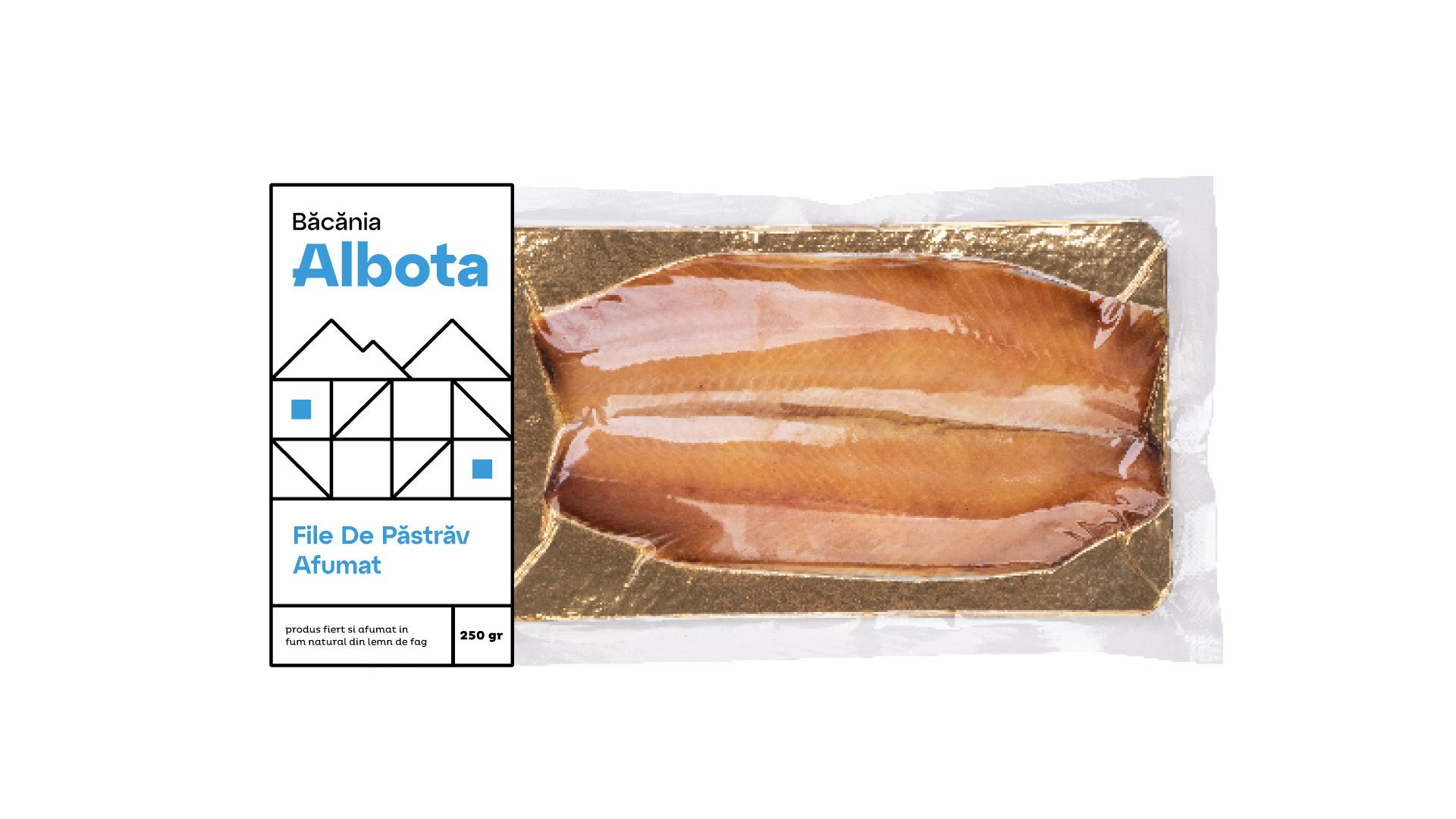
Our main challenge was accommodating a family-run business that lacked specialized labeling equipment. We appreciated the manual application of labels and aimed to ensure cost-efficiency and operational feasibility in our design.
To address this challenge, we introduced a system of squares, providing scalability and consistency across a diverse range of products, from delectable jams to fresh fish and dairy delights. Scalability and real-world applicability were paramount considerations throughout the design process, guaranteeing that our branding could be effortlessly implemented within their unique operational constraints.
Third on the list, interior design.
We were also involved in the physical transformation of our client's grocery store. For this, we enlisted the invaluable assistance of one of our esteemed past clients. If you guessed it was P A T R U, you're absolutely correct! Beatrice and Diana developed innovative concepts for the store's redesign, while here at Beam, we ensured that the design aligns with the brand's core principles.
Fourth on the list, website.
For this specific project, we decided to retain the platform they were using prior to our involvement. While our design options were somewhat limited, logistics took precedence. We collaborated closely with the platform's developers to align the website with its new branding. You can view the results at www.bacaniaalbota.ro.
Fifth on the list, social media and communication.
Detailed in the next chapter.
Social Media management
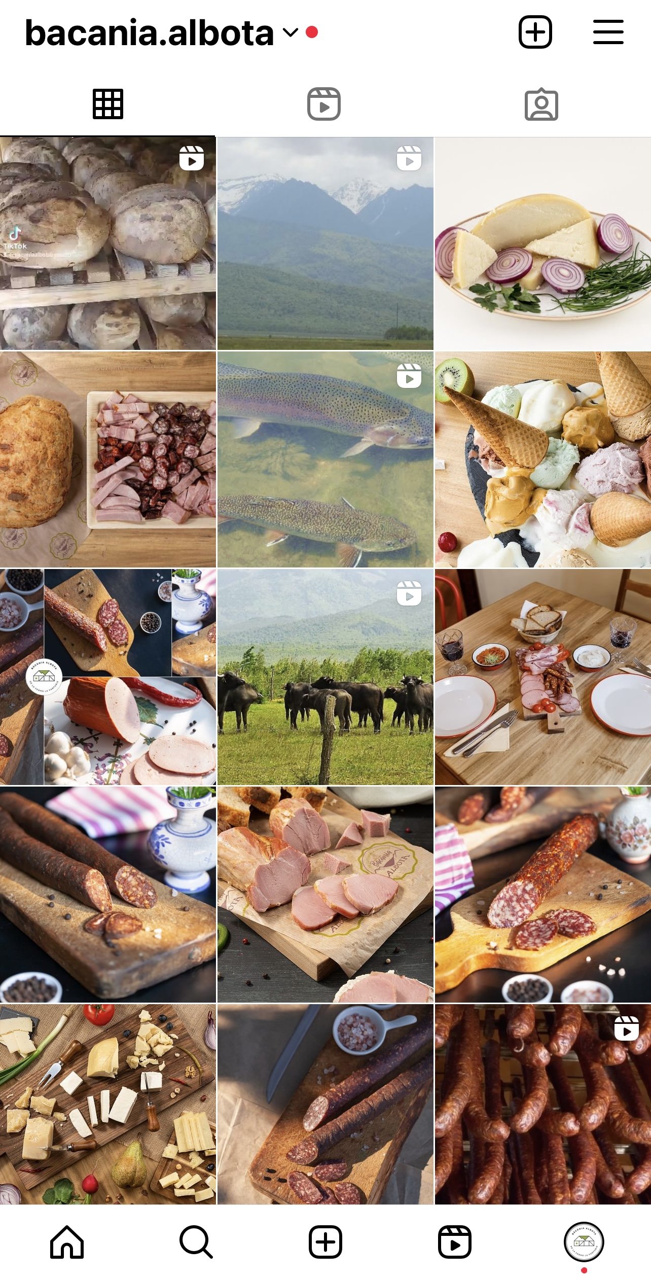
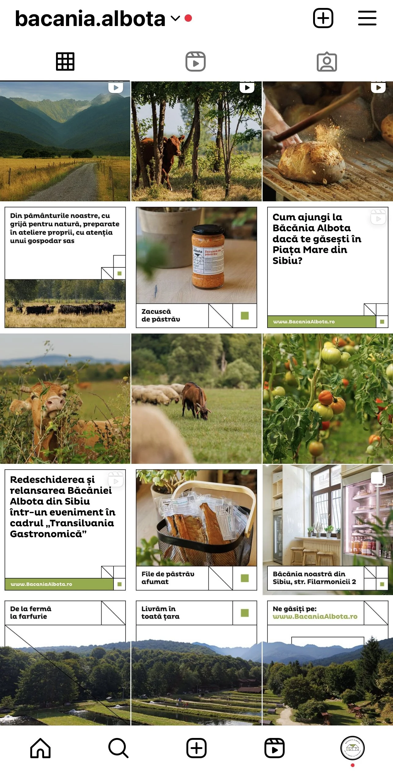
Recognizing the need to rectify inconsistent communication, we brainstormed innovative ideas that could be readily implemented or reserved for future use, aligning with the owner's convenience. To simplify matters for our client, we will manage the business's social media profiles for a few months until they are ready to take over themselves, providing a case study of how the social media channels should be administered.
Here’s a before & after:
Team & thanks
Client: Roxana Dobrilă;
Project & brand manager: Alexandra Crăciun;
Brand design: Symbold Studio - Ovidiu Pop & Alex Kun;
Social Media grid design & DTP: Iulian Tărnăuceanu;
Photography: ShutterUp;
Video: Tudor Muntean;


